Proyecto Inmigrante ICS
Veinte años de una organización que acompaña a migrantes en Texas, resumidos en un símbolo y todo lo que salió de él.
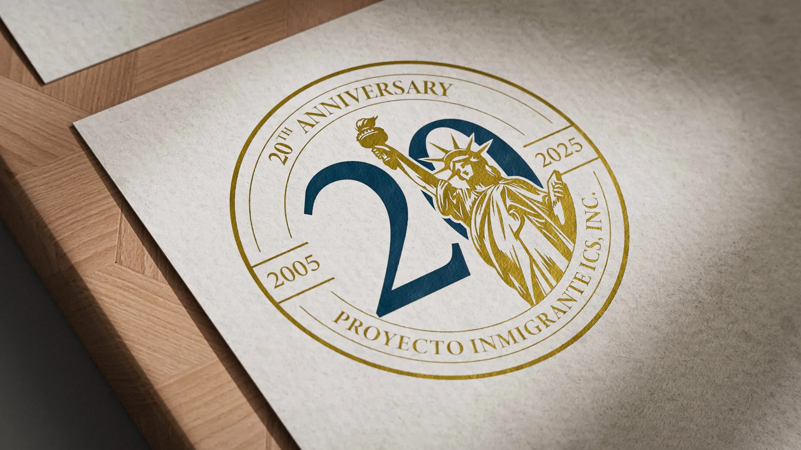
Proyecto Inmigrante ICS es una organización de Texas fundada en 2005 que da servicios legales de inmigración y educación cívica: talleres de ciudadanía, cursos de civismo e historia de Estados Unidos, foros sobre trámites migratorios. Gente que ayuda a otra gente a quedarse.
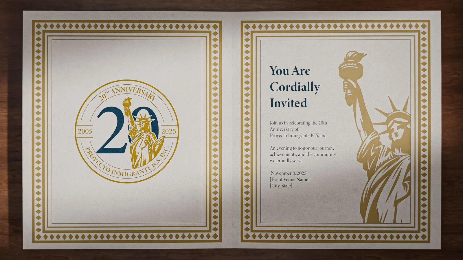
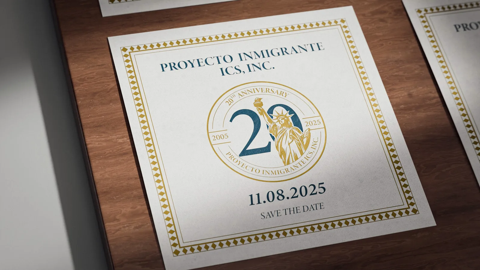
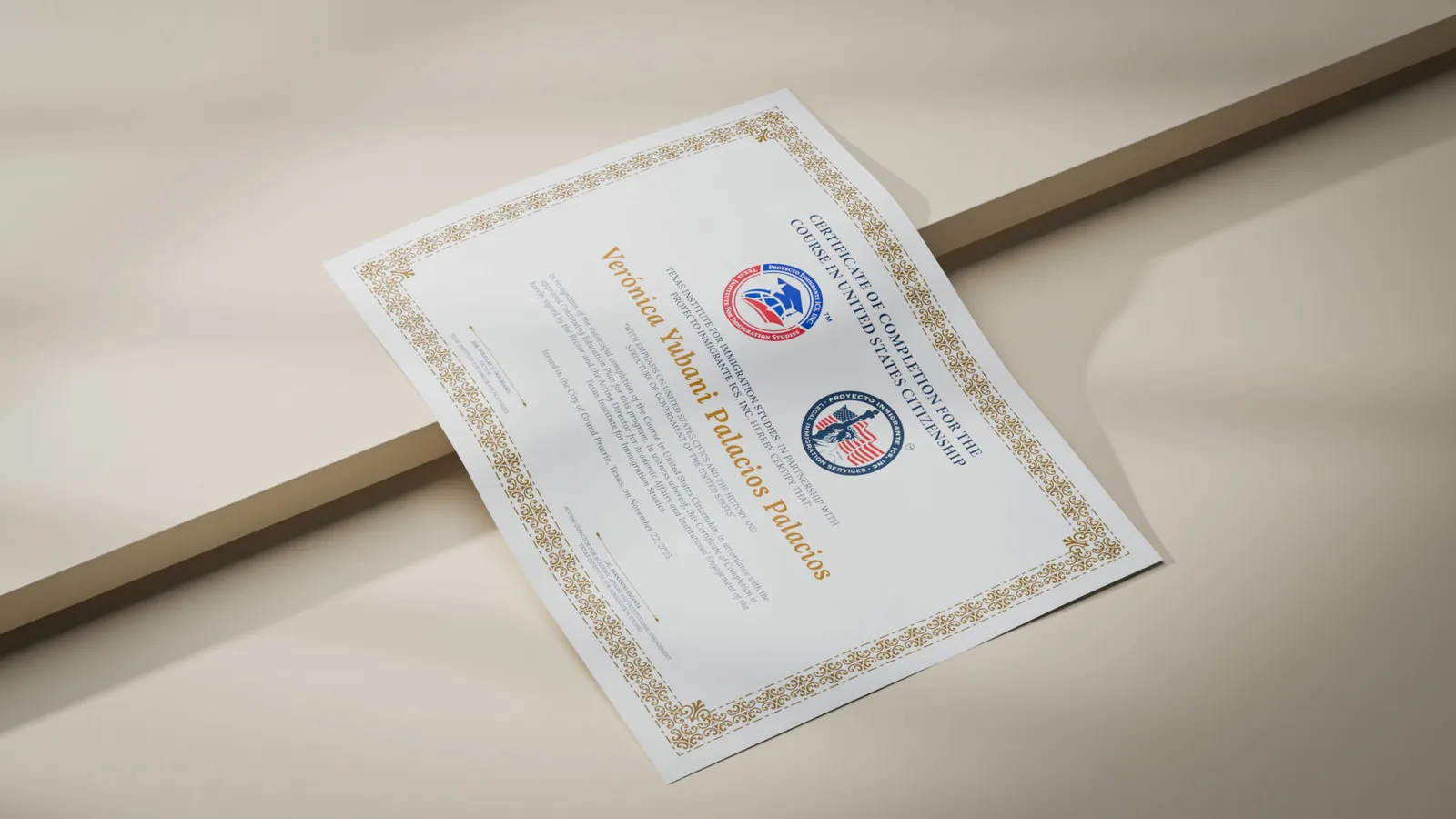
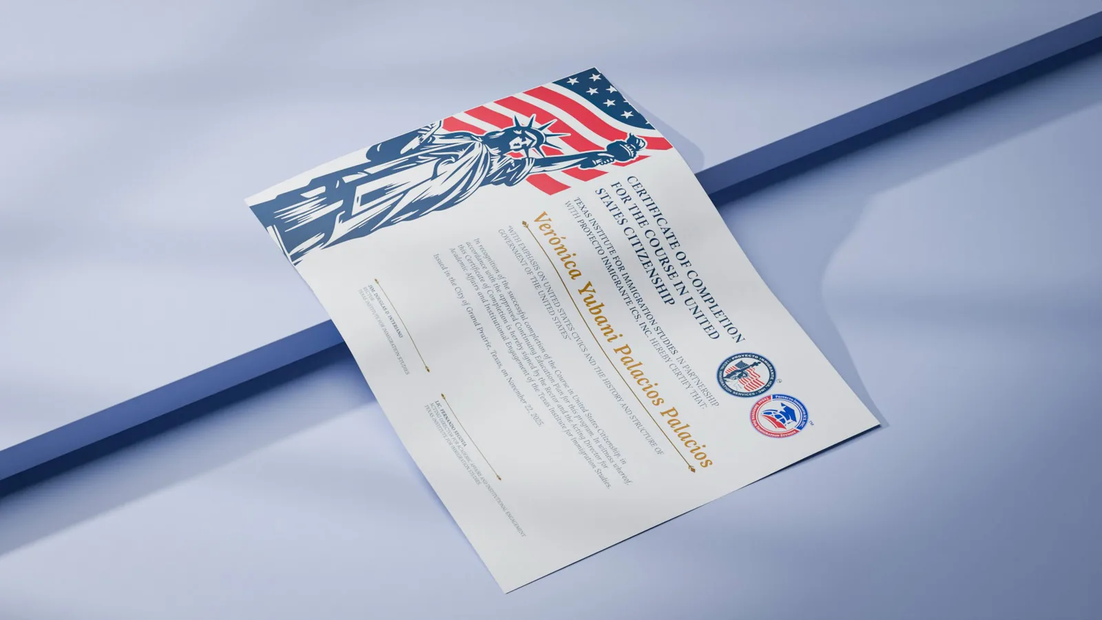
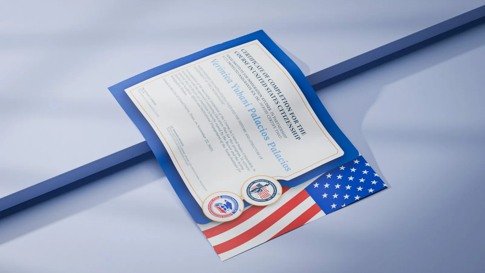
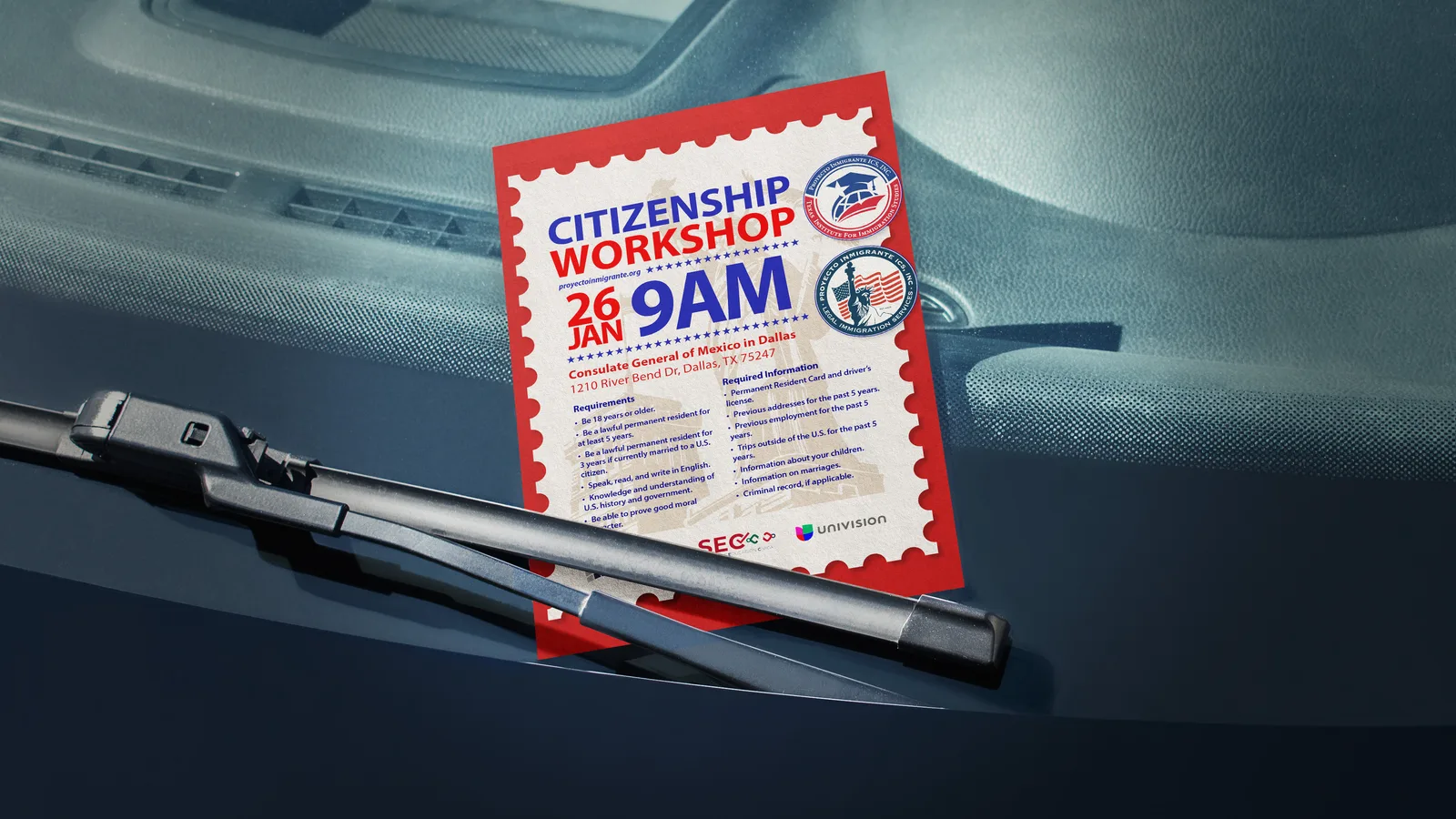
Empecé recomponiendo el logo del instituto y de ahí llegó el encargo grande: un logotipo conmemorativo por los veinte años, de 2005 a 2025, que iba a encabezar un fundraiser y todo el material de la organización, impreso y digital. Con el tiempo el cliente fue pidiendo más piezas: invitaciones, certificados, flyers. Lo que se ve aquí es una selección de ese trabajo continuo.
Sobre el logo nuevo había una condición clara. Tenía que convivir con el original del instituto y entenderse a simple vista: clásico, patriótico, sin símbolos que alguien tuviera que descifrar. De ahí la Estatua de la Libertad, el veinte al centro marcando el aniversario y una paleta de azul con dorado que suena institucional sin salirse del registro que la organización ya tenía.
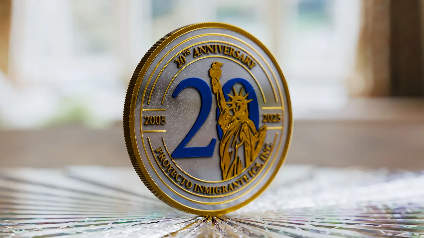
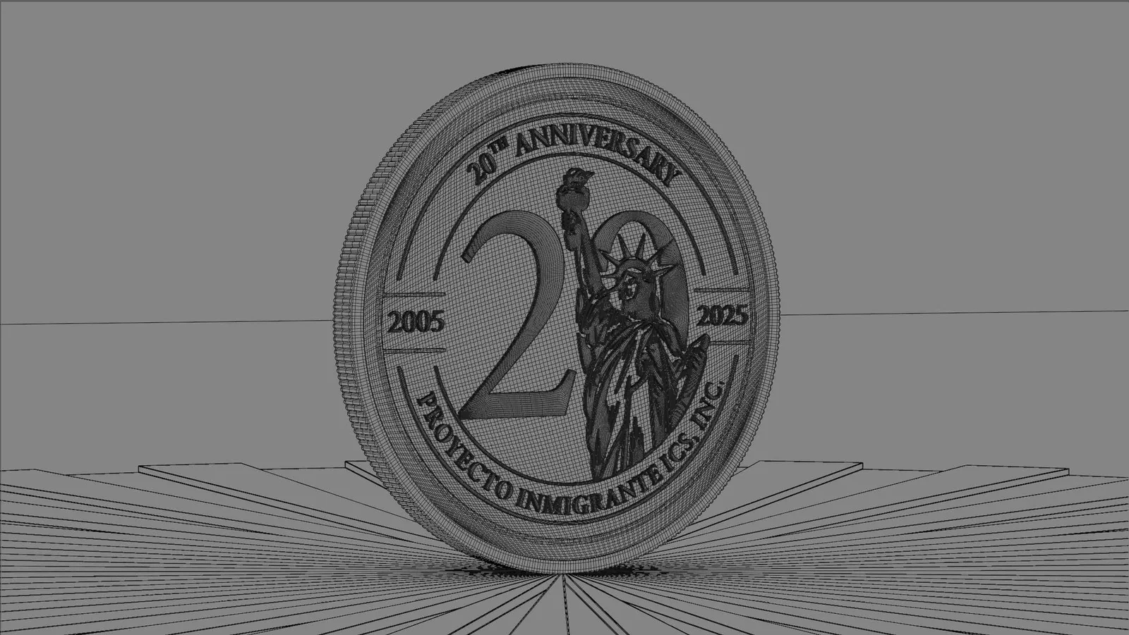
La moneda conmemorativa se modeló y renderizó en 3D. En el comparador de arriba las dos mitades son el mismo archivo: de un lado el render final, del otro su malla dentro del visor. No es una fotografía ni una imagen generada, es geometría.
Proyecto Inmigrante ICS is a Texas organization founded in 2005 that provides legal immigration services and civic education: citizenship workshops, courses on U.S. civics and history, forums on immigration paperwork. People helping other people stay.
I started by rebuilding the institute’s logo and out of that came the big one: a commemorative logo for the twenty years, 2005 to 2025, that was going to head up a fundraiser and all of the organization’s material, printed and digital. Over time the client kept asking for more pieces: invitations, certificates, flyers. What you see here is a selection of that ongoing work.
There was one clear condition on the new logo. It had to sit next to the institute’s original and be understood at a glance: classic, patriotic, no symbols anybody would have to decode. Hence the Statue of Liberty, the twenty at the center marking the anniversary, and a blue and gold palette that sounds institutional without leaving the register the organization already had.
The commemorative coin was modeled and rendered in 3D. In the comparison above, both halves are the same file: the final render on one side, its mesh inside the viewport on the other. It is not a photograph and it is not a generated image, it is geometry.
Proceso