Sabia
Una etiqueta de precio y una S, para una app que sirve para gastar menos.

Sabia es una app para comparar precios y ofertas de supermercado: te dice dónde está más barato lo que vas a comprar. Todavía está en desarrollo. El encargo fue el logotipo, no el producto.
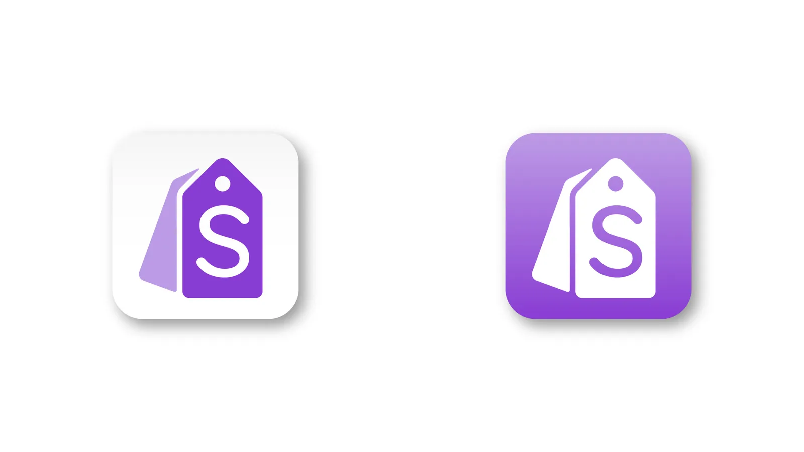
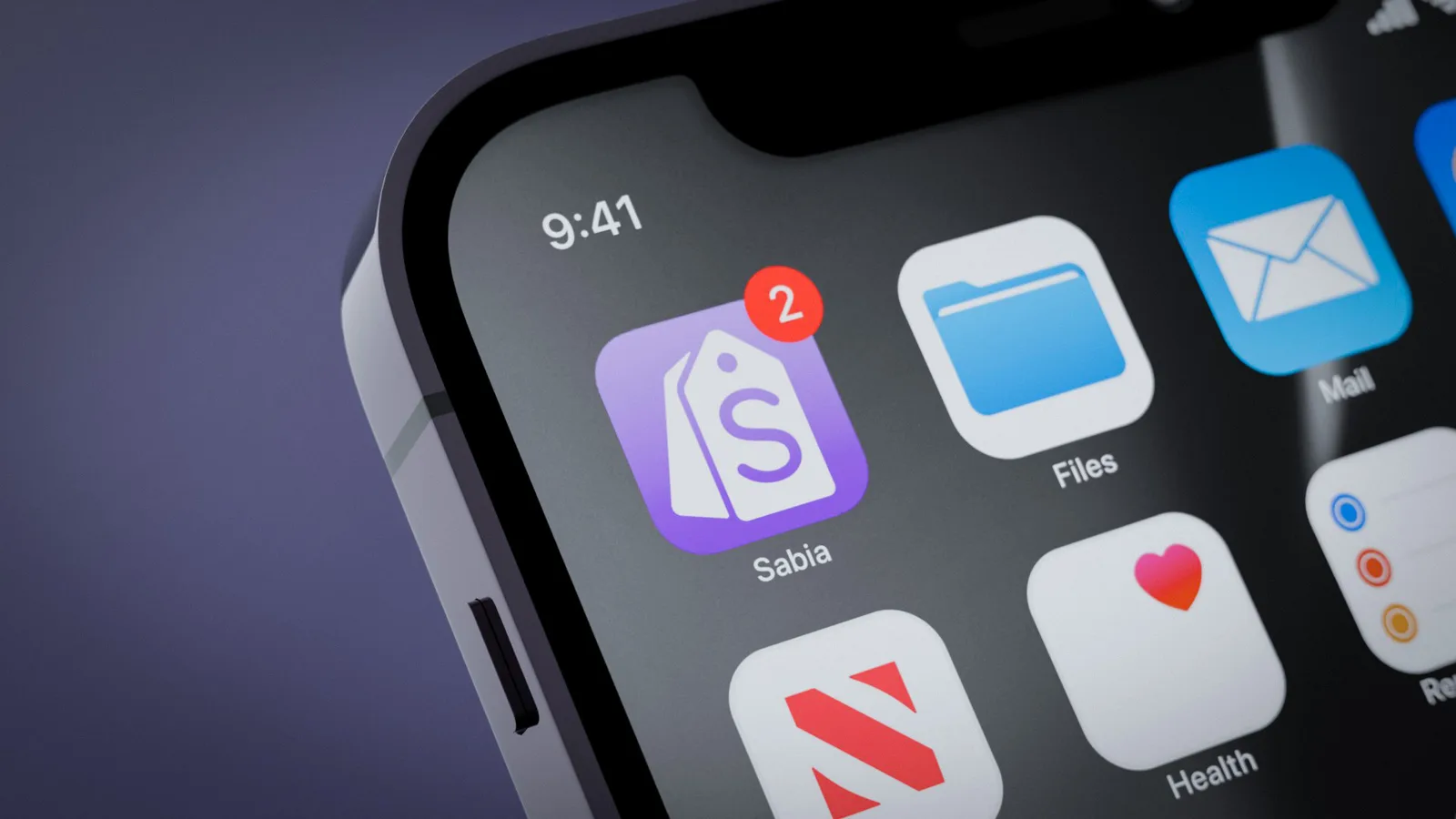
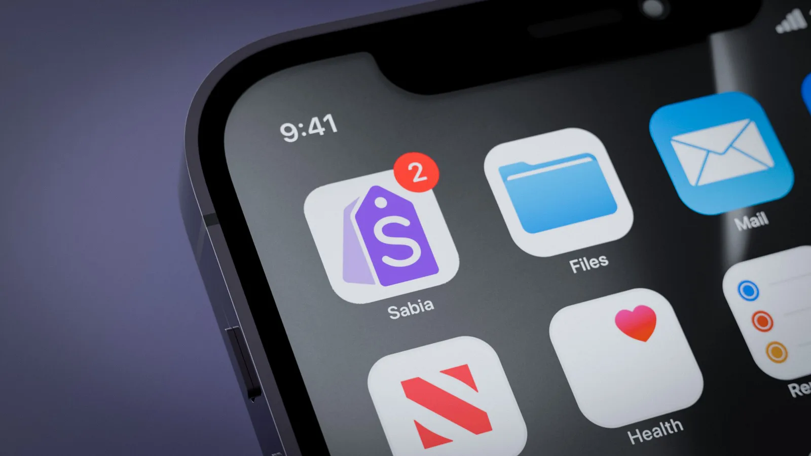
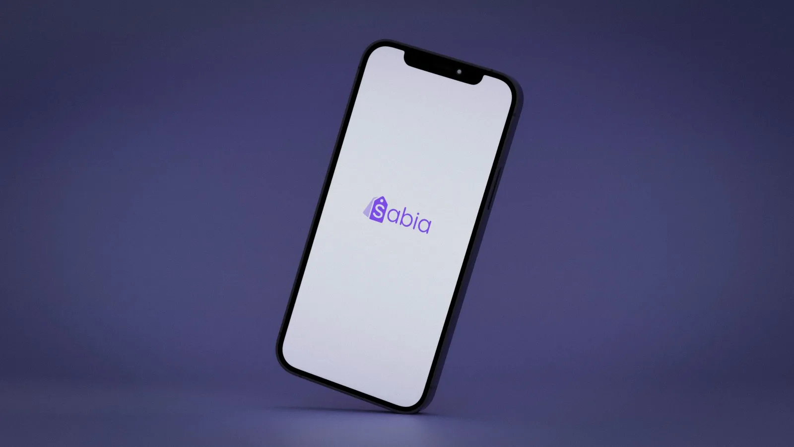
El símbolo junta dos cosas. Una etiqueta de precio, que apunta directo a para qué sirve la app y no necesita que nadie la explique, y una S resuelta dentro de esa misma etiqueta, para que la forma se asocie con el ahorro antes que con la marca. Es un logo que quiere que entiendas qué hace la app antes de que recuerdes cómo se llama.
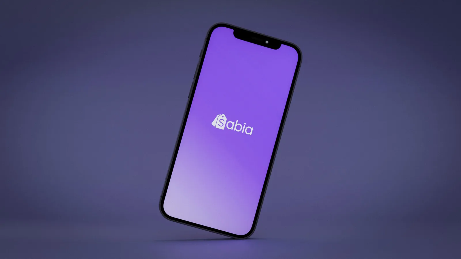
El morado salió por descarte: es el color que su competencia no estaba usando. En una categoría donde casi todos van a rojo o a amarillo, que son los colores del descuento, salirse es una forma barata de que te vean.
Sabia is an app for comparing supermarket prices and deals: it tells you where what you are about to buy is cheapest. It is still in development. The job was the logo, not the product.
The symbol puts two things together. A price tag, which points straight at what the app is for and needs nobody to explain it, and an S resolved inside that same tag, so the shape gets associated with saving before it gets associated with the brand. It is a logo that wants you to understand what the app does before you remember what it is called.
The purple came by elimination: it is the color the competition was not using. In a category where almost everyone goes red or yellow, which are the colors of a discount, stepping out is a cheap way to get noticed.
Video
Proceso