Bernez Biomédica
Una marca para el mantenimiento de equipo médico, construida sobre una sola letra partida en dos.
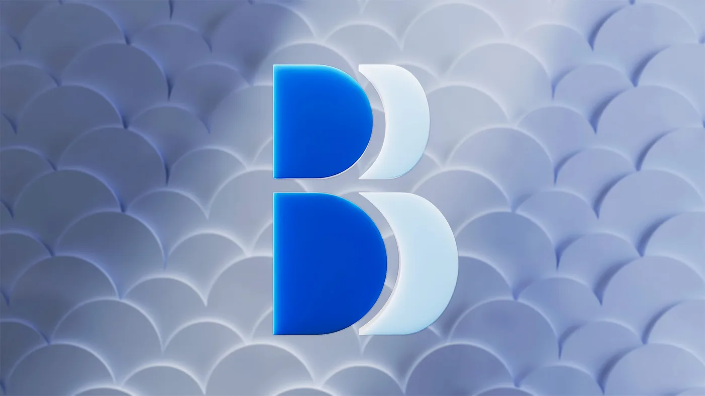
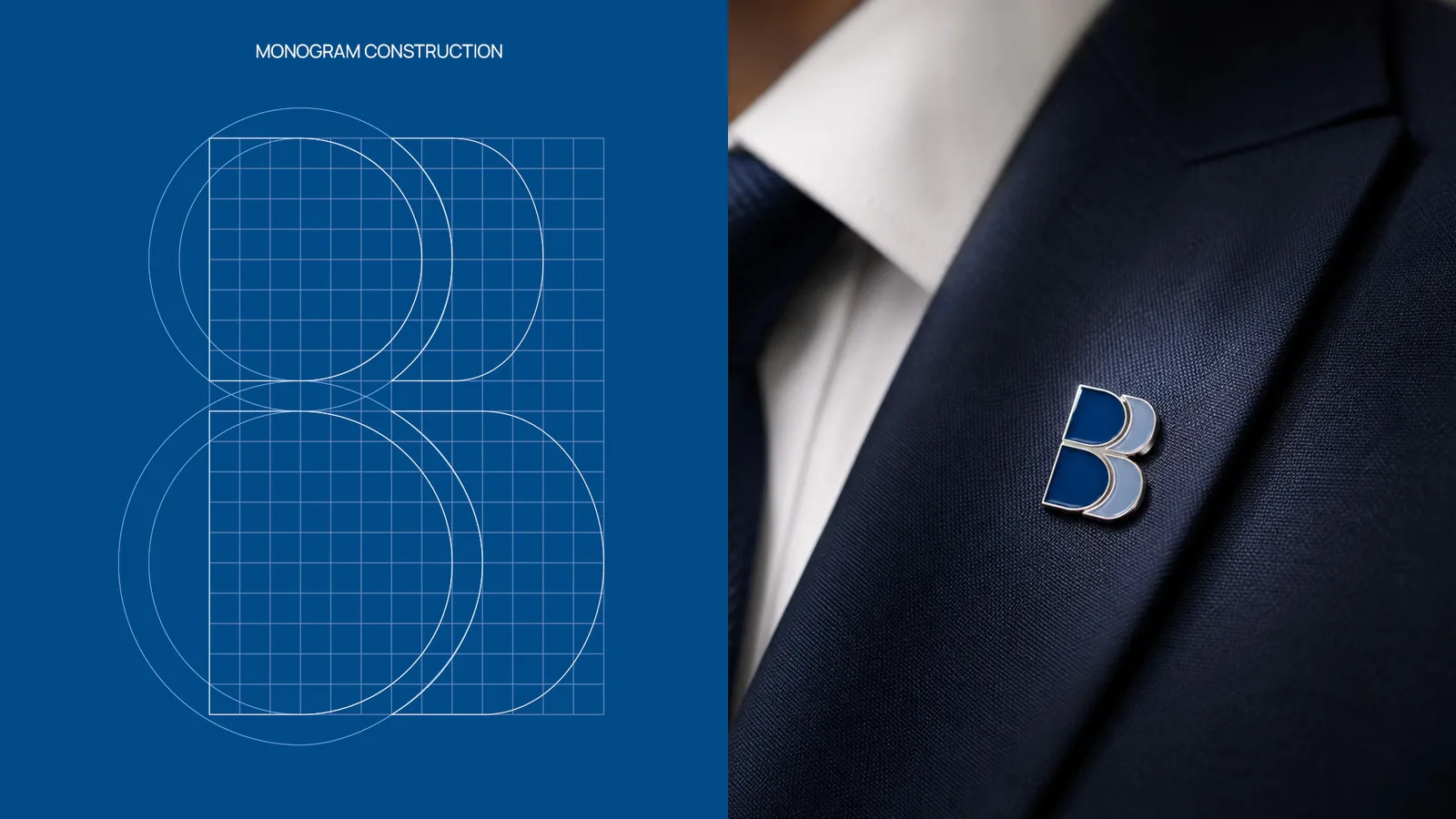
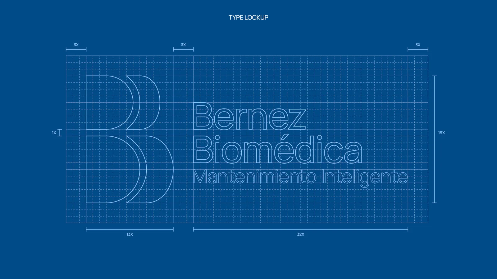
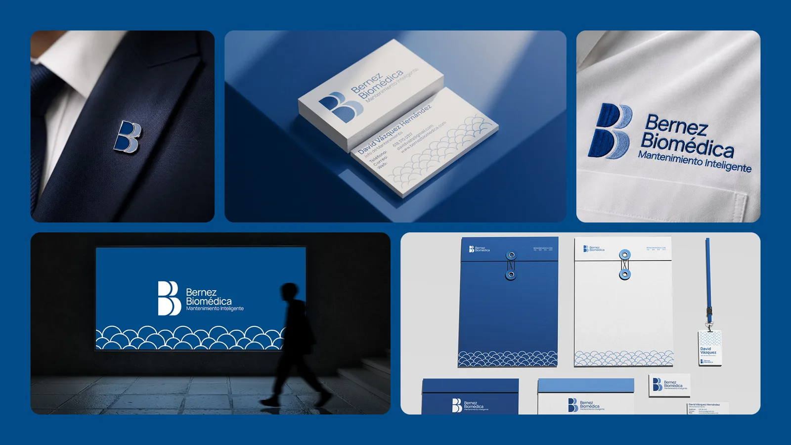
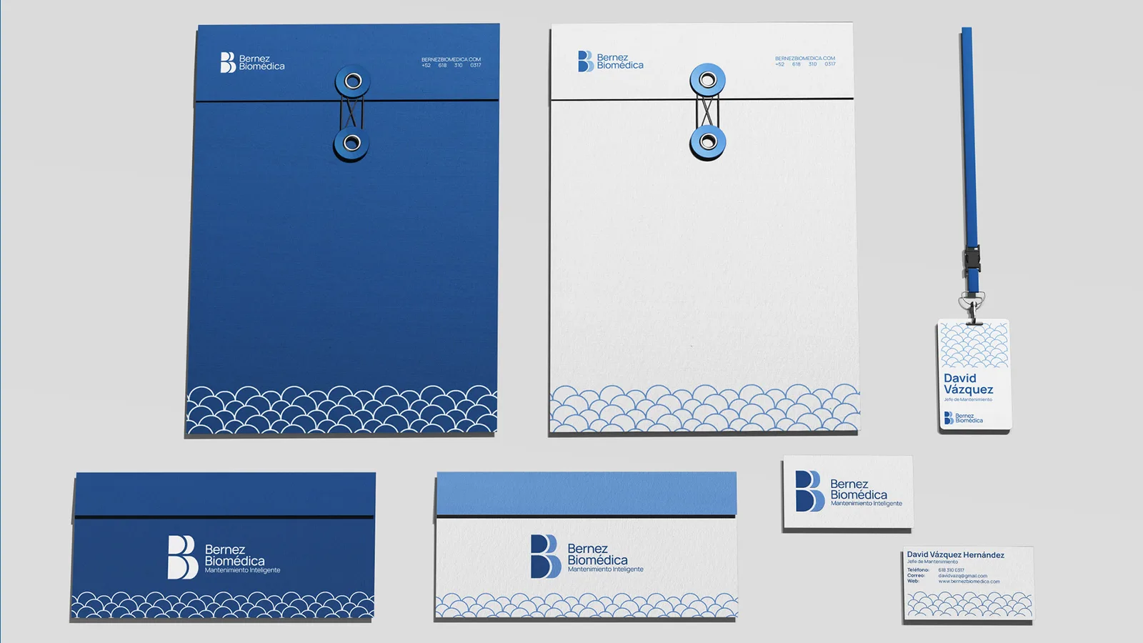
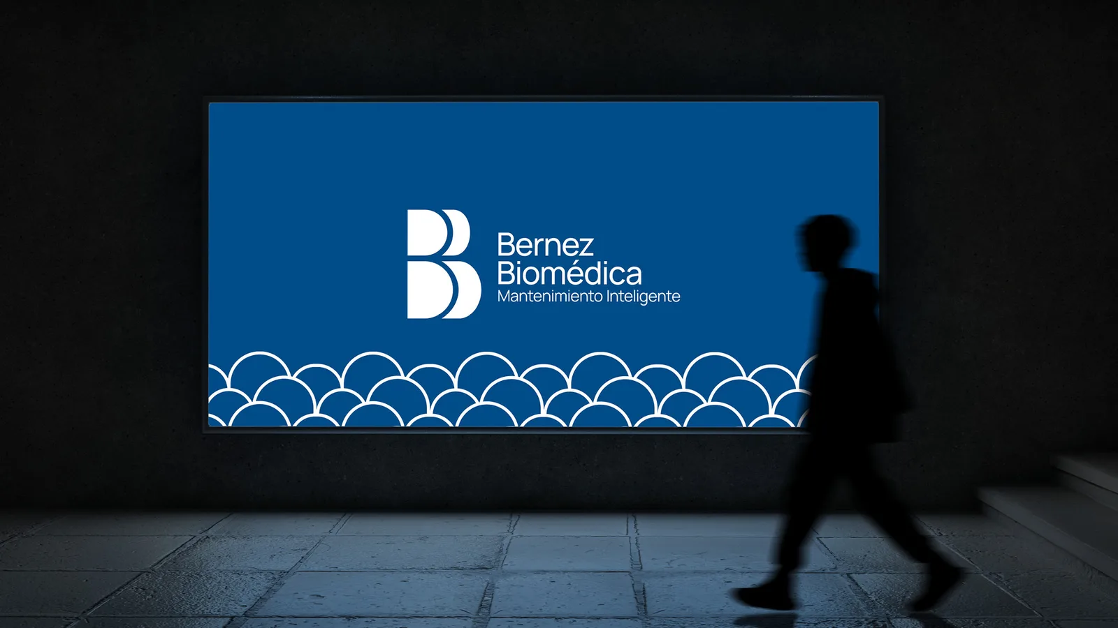
Bernez Biomédica da mantenimiento preventivo a equipo médico y de laboratorio, y deja cada reporte en la nube para que el cliente lo consulte cuando quiera. El logo es una sola letra B, partida por la mitad. Partida así, el ojo termina leyendo dos B juntas, que es el nombre, y también las dos mitades del servicio: el técnico que llega a revisar el equipo y el registro digital que queda después. De esa figura sale todo lo demás.
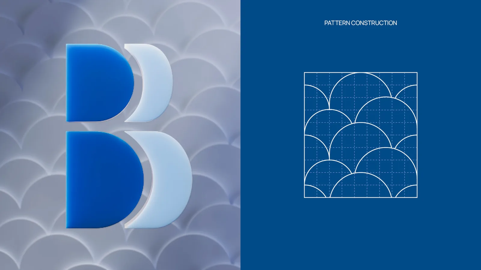
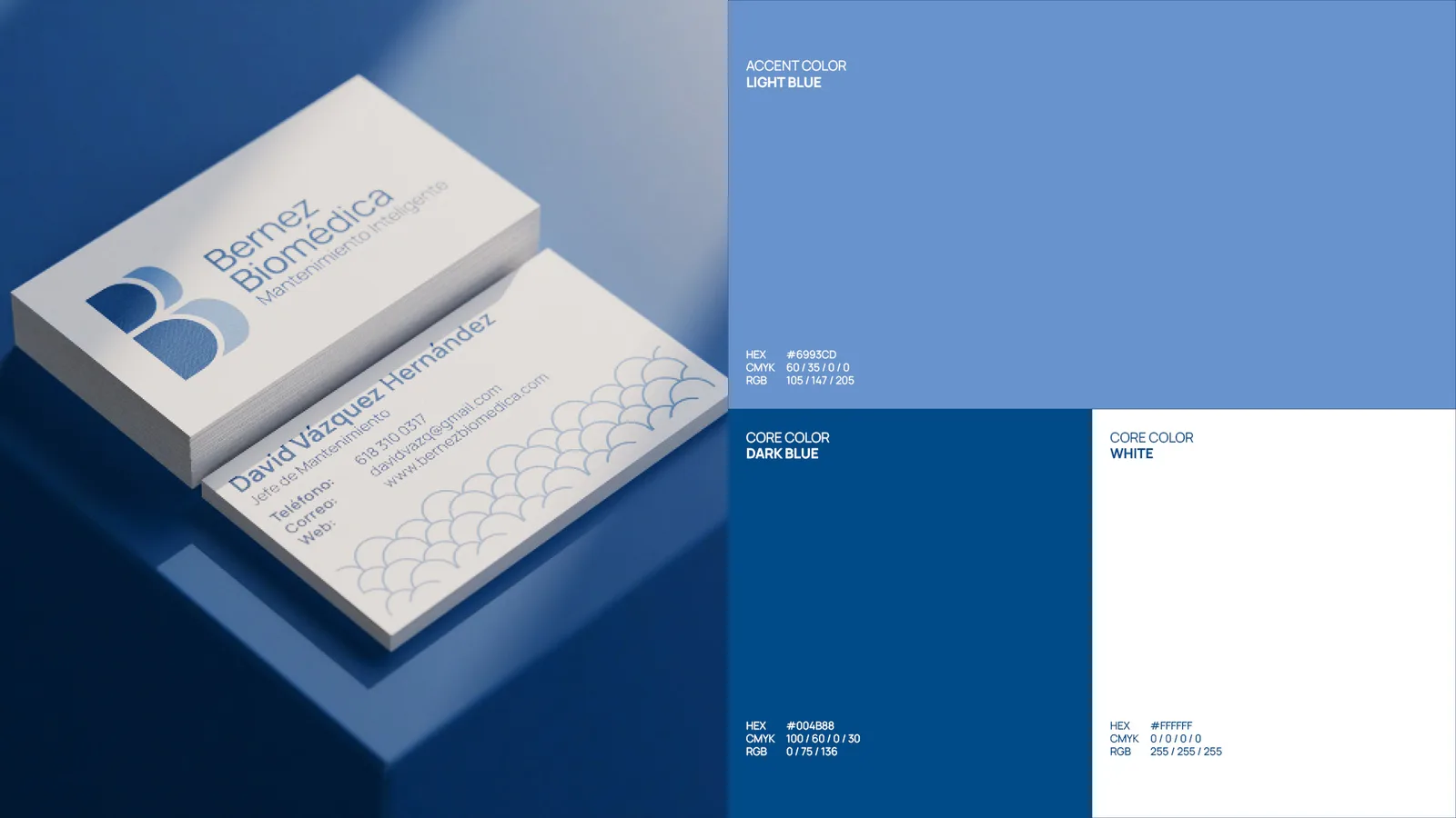
El hueco entre las dos mitades hace trabajo doble. De frente es el canal por donde pasa la información, que es lo que sostiene el servicio. Inclinado, el ícono se lee como una nube, y ahí está la plataforma de reportes que Bernez tiene y su competencia no. La paleta se queda en un solo color: azul fuerte de base, azul cielo de acento, fondo blanco. Es el azul de hospital, que es donde la marca trabaja.
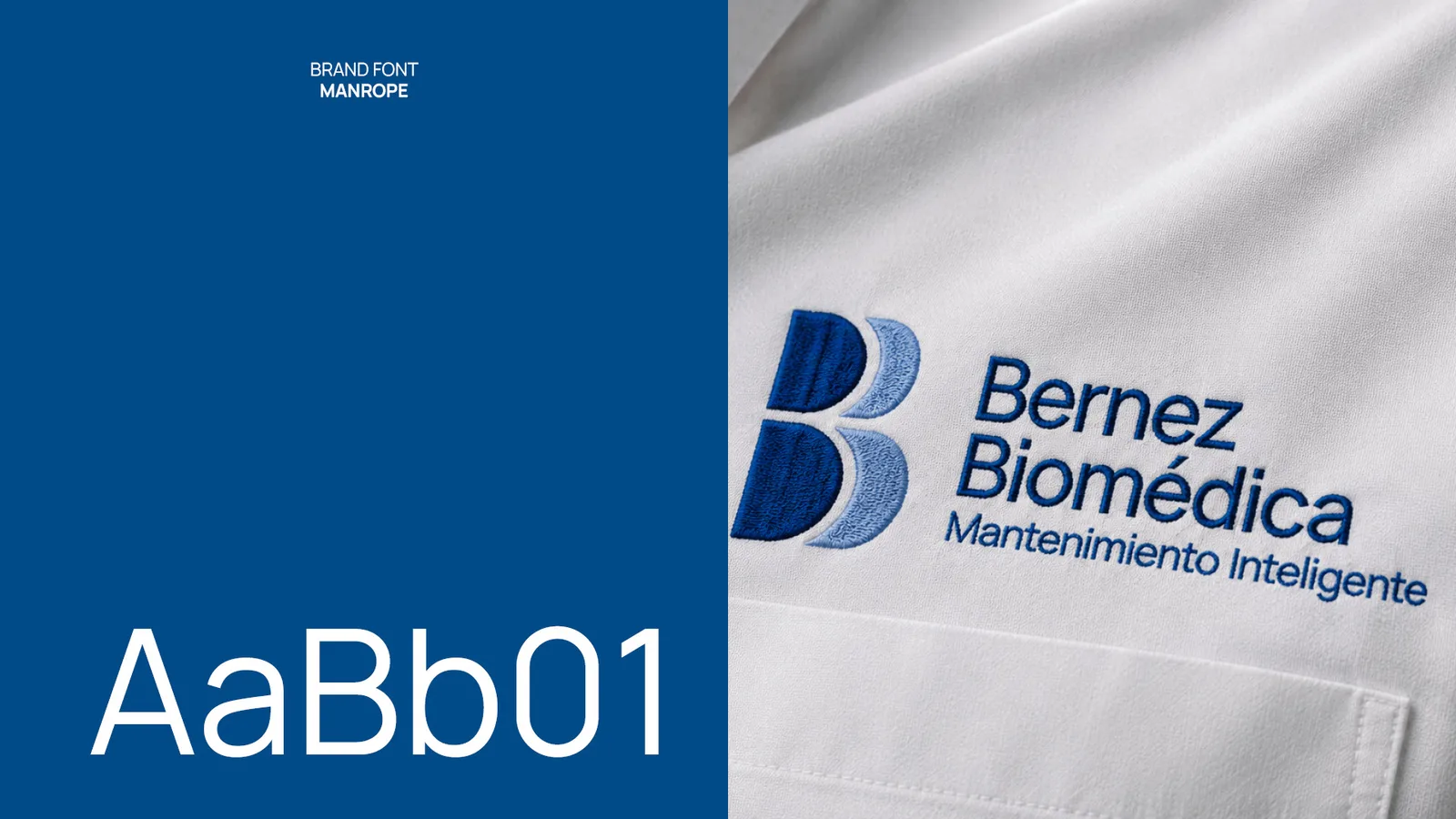
Para la tipografía elegí Manrope. Es geométrica y contemporánea, se lee técnica y precisa, pero no tiene el filo frío de otras geométricas, y eso era importante en un sector serio donde la marca igual quería sonar cercana.
Bernez Biomédica does preventive maintenance on medical and lab equipment, and leaves every service report in the cloud so the client can pull it up whenever they want. The logo is a single letter B, split down the middle. Split that way, your eye ends up reading two B’s side by side, which is the name, and also the two halves of the service: the technician who shows up to check the equipment and the digital record that stays behind. Everything else grows out of that shape.
The gap between the two halves does double duty. Head on, it is the channel the information runs through, which is what holds the service together. Tilted, the icon reads as a cloud, and that is the reporting platform Bernez has and its competitors do not. The palette stays in one color: deep blue as the base, sky blue as the accent, white behind them. It is hospital blue, which is where the brand works.
For the typeface I picked Manrope. It is geometric and contemporary, it reads technical and precise, but it does not have the cold edge other geometrics have, and that mattered in a serious field where the brand still wanted to sound approachable.
Proceso