Rembrandt Cook
Tres prendas para una cafetería que se llama como un pintor, y que decidió tomárselo en serio.

Rembrandt Cook es una cafetería que se llama así porque a su dueño le gusta el pintor. El encargo era merch para vender en mostrador: tres prendas, cada una con su propio diseño. Ese nombre, que pudo quedarse en dato curioso, fue el punto de partida de todo.
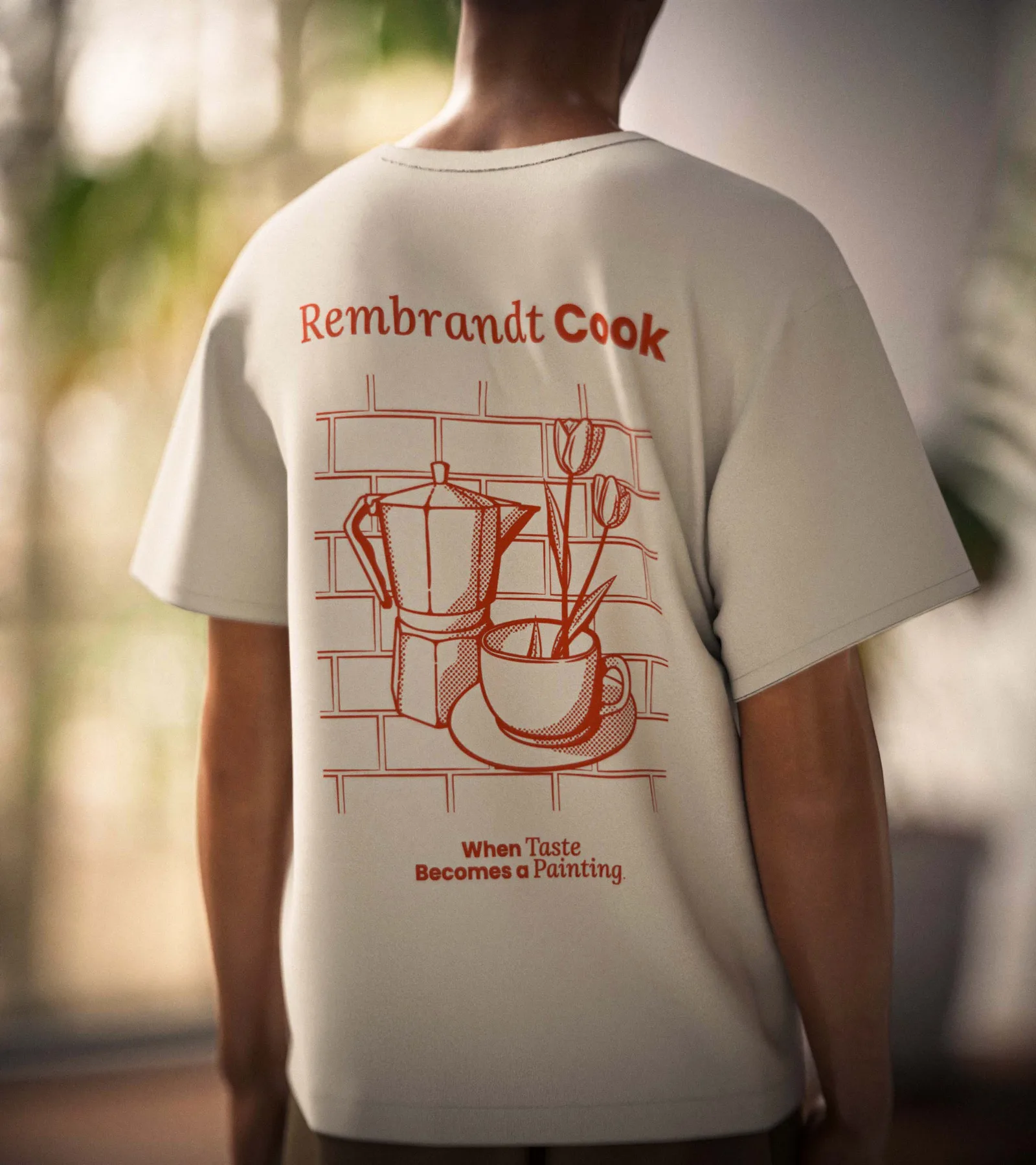
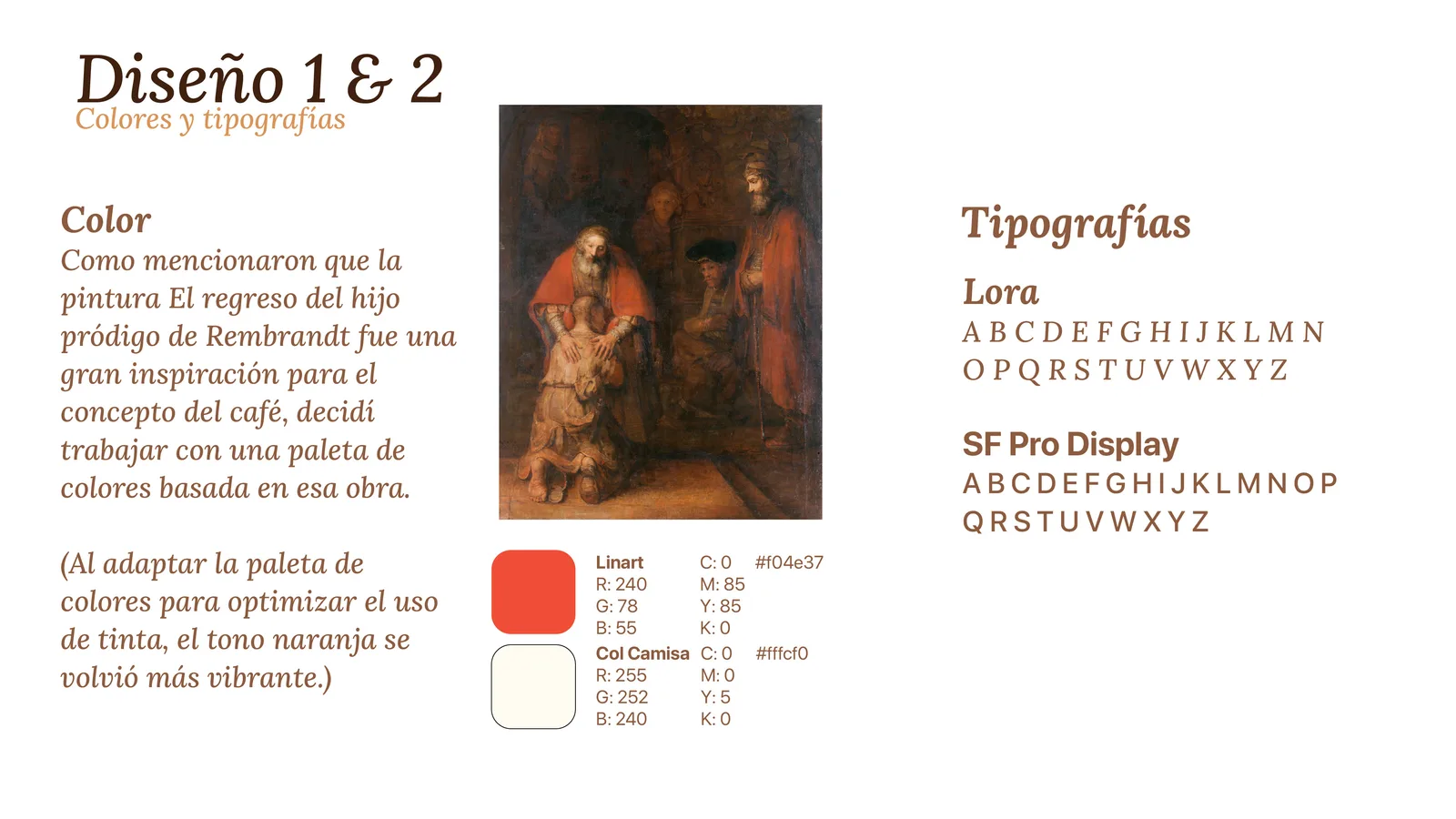
La playera salió del Instagram del café. En concreto, de una foto de una taza con girasoles, a la que le sumé una moka que aparecía en otra publicación suya y unos tulipanes dentro de la taza, de la variedad que se conoce como tulipanes de Rembrandt, para amarrar el nombre por otro lado. El sombreado va en halftone, una técnica de ilustración clásica con textura de imprenta antigua. La paleta, naranja vibrante sobre crema, viene de El regreso del hijo pródigo, el cuadro que el dueño mencionó como inspiración del concepto.
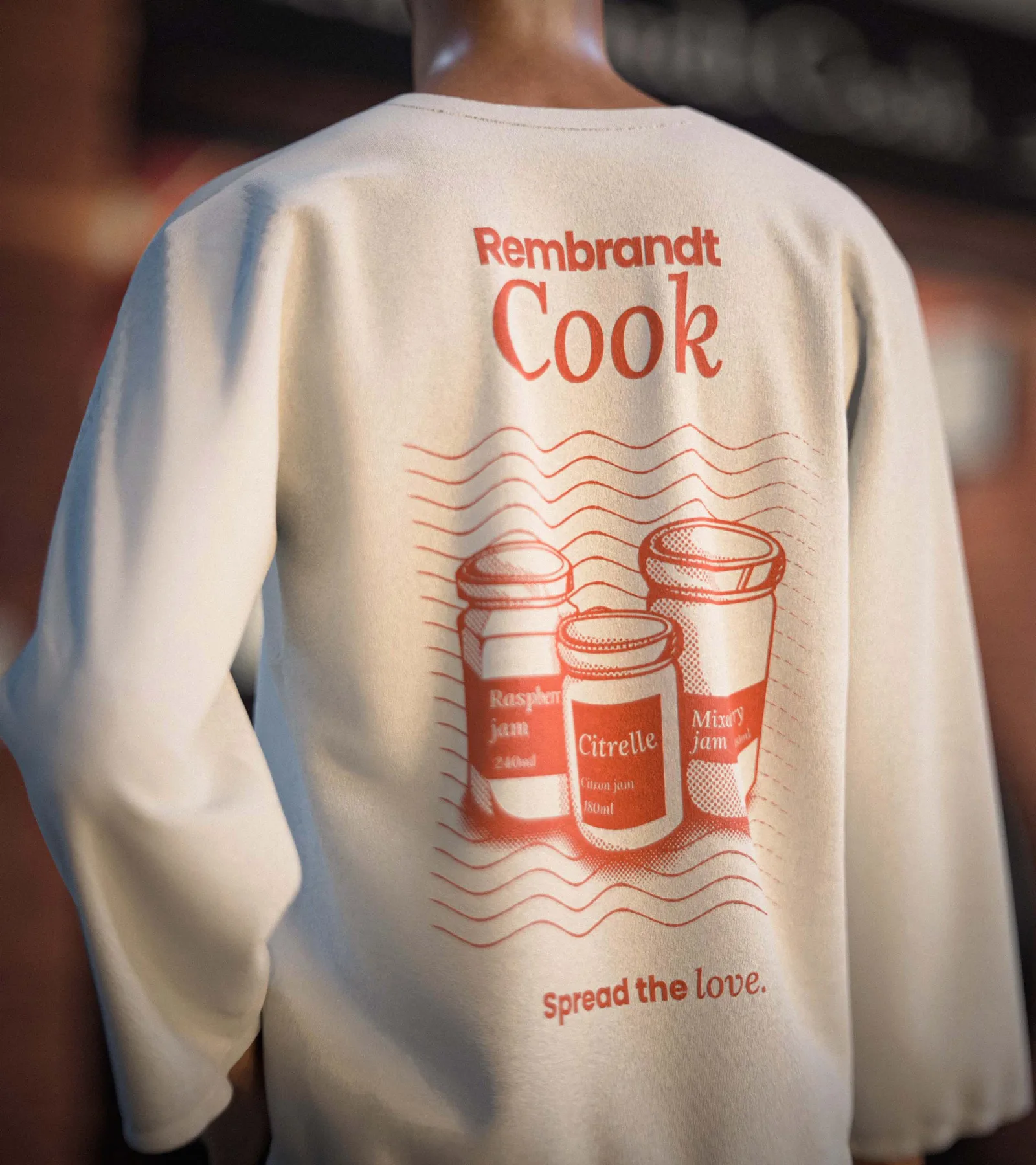
El suéter parte de las mermeladas artesanales que vende el café. Se trazaron en vectores a partir de fotografías reales de los frascos, con el mismo halftone y la misma paleta, para que las dos primeras piezas se leyeran como familia.
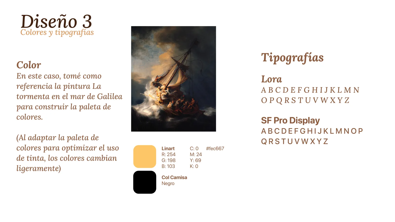
El hoodie cambia de registro porque el cliente lo pidió así: quería algo más streetwear y con colores más fuertes. La base es uno de los autorretratos de Rembrandt, con La tormenta en el mar de Galilea asomando de fondo lo justo para que se lea sin saturar, y una frase del propio pintor traducida. El amarillo sobre negro también sale de ese cuadro.
Rembrandt Cook is a coffee shop named that way because its owner likes the painter. The job was merch to sell at the counter: three garments, each with its own design. That name, which could have stayed a piece of trivia, ended up being the starting point for everything.
The t-shirt came off the shop’s Instagram. Specifically, off a photo of a cup with sunflowers, to which I added a moka pot that showed up in another one of their posts and some tulips inside the cup, the variety known as Rembrandt tulips, to tie the name down from another angle. The shading runs in halftone, a classic illustration technique with the texture of old printing. The palette, bright orange on cream, comes from The Return of the Prodigal Son, the painting the owner brought up as the inspiration for the concept.
The sweater starts from the artisanal jams the shop sells. They were traced into vectors from actual photographs of the jars, with the same halftone and the same palette, so the first two pieces would read as family.
The hoodie changes register because the client asked for it that way: he wanted something more streetwear and with stronger colors. The base is one of Rembrandt’s self-portraits, with The Storm on the Sea of Galilee showing through behind it just enough to read without crowding, and a line from the painter himself, translated. The yellow on black comes out of that painting too.
Proceso