Voces Migrantes Duranguenses
Un sitio para la organización que acompaña a los duranguenses que hicieron su vida del otro lado.
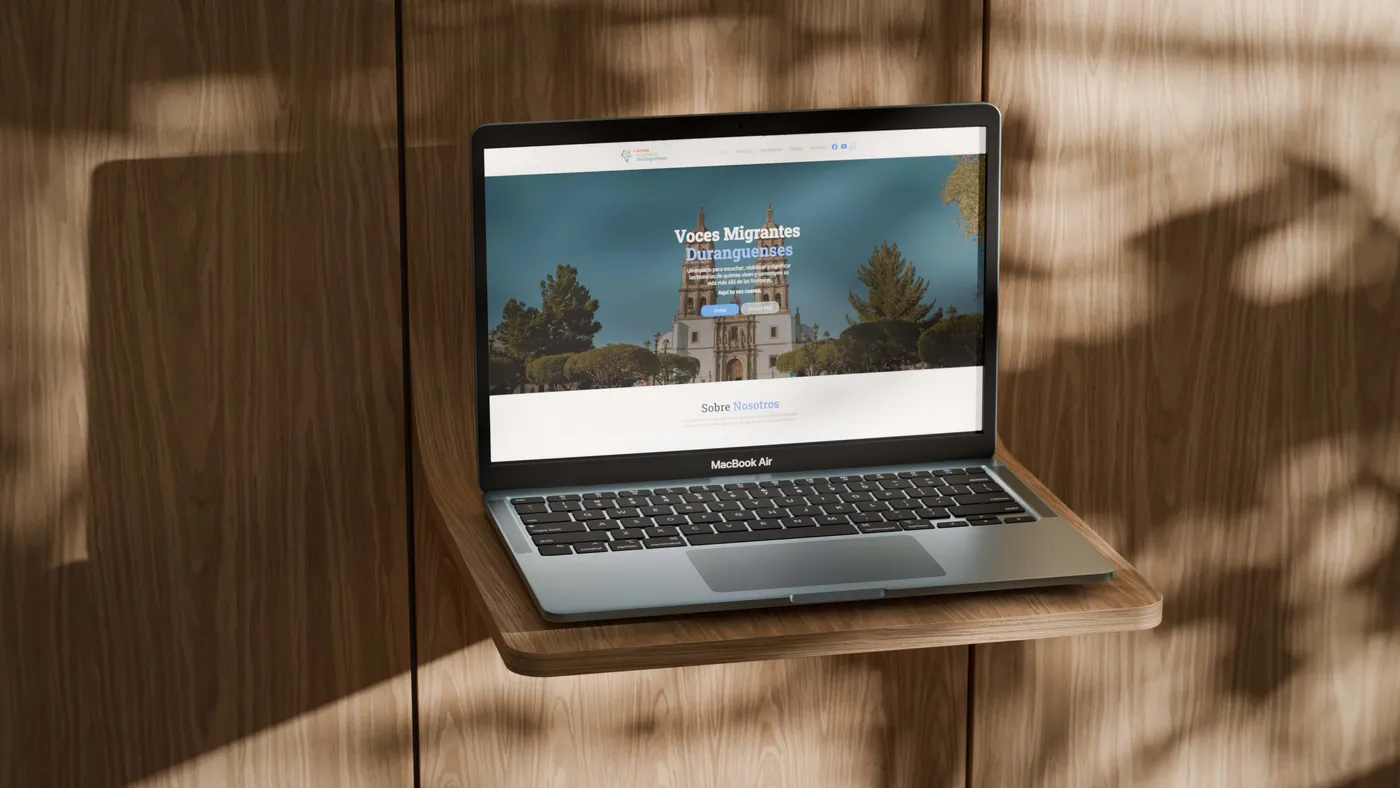
Voces Migrantes Duranguenses es una organización sin fines de lucro que fortalece a la comunidad migrante duranguense con apoyo social, promoción cultural y programas educativos. Su público está repartido entre dos países, así que el sitio tenía que funcionar igual para alguien que lo abre en Durango y para alguien que lo abre en Estados Unidos.
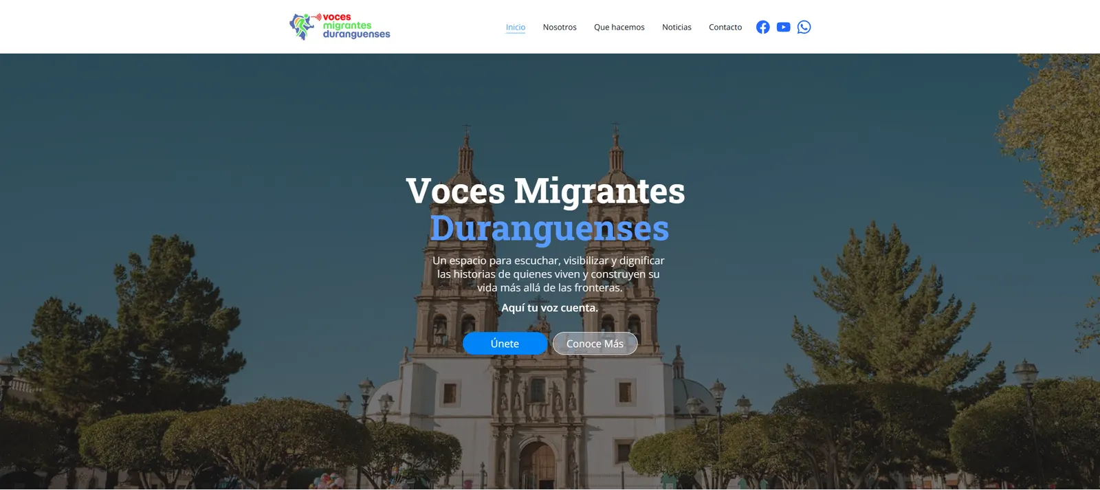
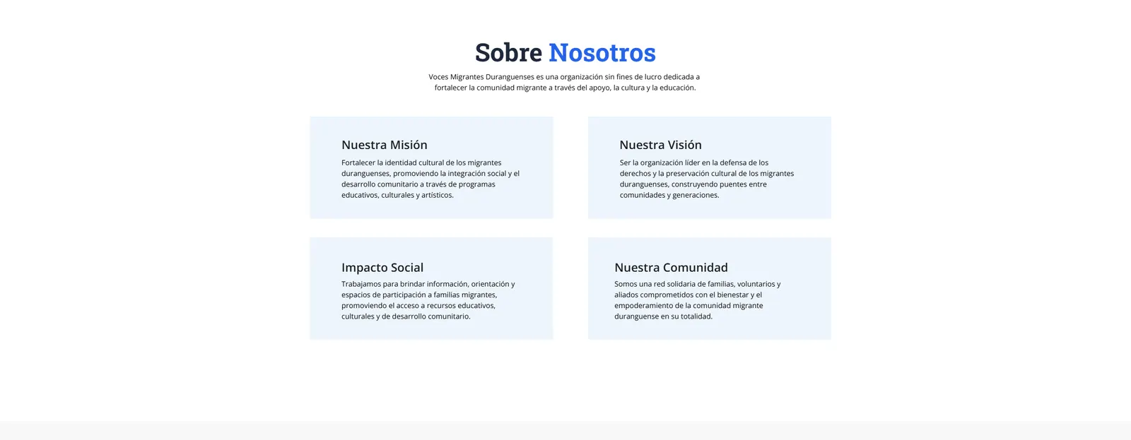
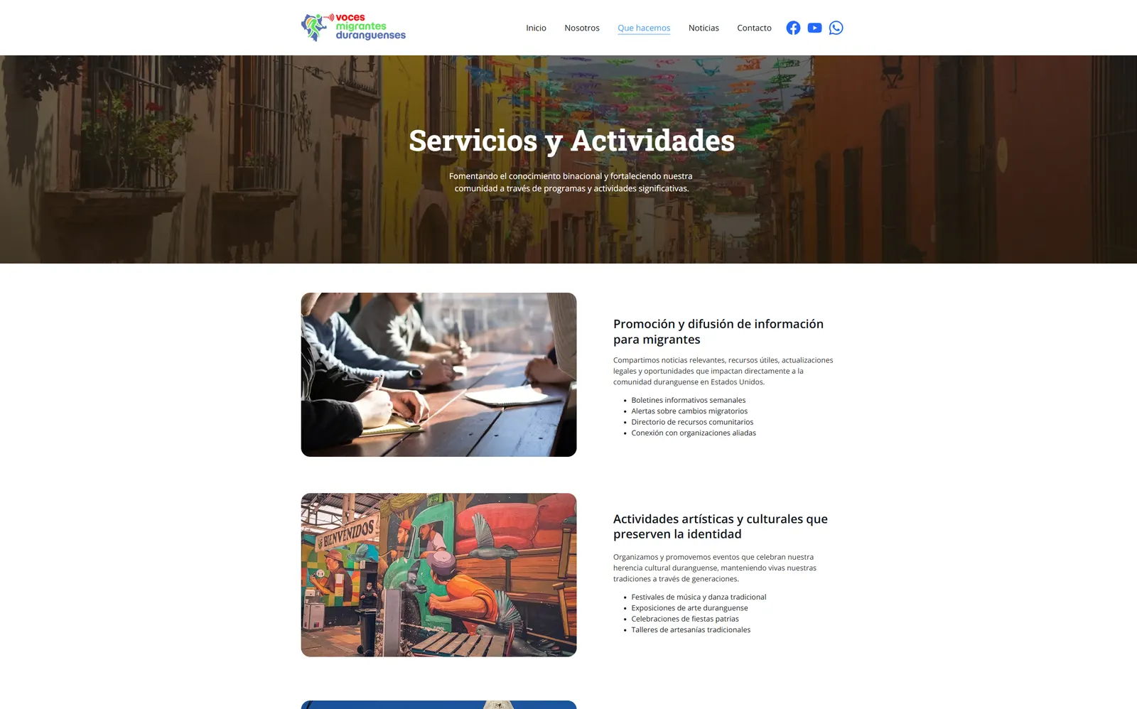
Trabajé la estructura y la interfaz con tres prioridades: claridad, accesibilidad y coherencia en la comunicación. La portada contesta en orden quiénes son, qué hacen y cómo contactarlos; los programas se detallan en su propia página, cada uno con la lista de lo que incluye, para que nadie tenga que suponer qué significa “promoción cultural”. El contacto está a un toque desde cualquier punto, con WhatsApp fijo en la esquina, porque es por donde llega la mayoría de la gente.
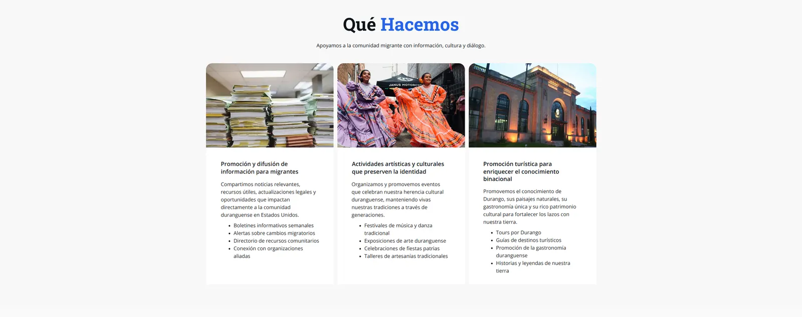
La organización ya tenía logotipo, así que la paleta del sitio se construyó a partir de sus azules sobre blanco, y las fotos hacen el resto: la catedral, la estación, las danzas, los talleres. Dos tipografías, una de palo seco para la estructura y una serif para los textos largos, que es lo que mantiene el tono cálido sin perder el aire institucional que necesita una organización que pide confianza.
Después del diseño vino la maquetación responsive, la configuración inicial de SEO y la gestión del dominio y el hospedaje, así que el proyecto no se entregó como archivo sino como sitio publicado y funcionando.
Voces Migrantes Duranguenses is a non-profit that strengthens the migrant community from Durango through social support, cultural promotion and educational programs. Its audience is split across two countries, so the site had to work the same for someone opening it in Durango and someone opening it in the United States.
I worked the structure and the interface around three priorities: clarity, accessibility and consistency. The home page answers, in order, who they are, what they do and how to reach them; the programs get their own page, each with the list of what it includes, so nobody has to guess what “cultural promotion” means. Contact is one tap away from anywhere, with WhatsApp pinned to the corner, because that is how most people arrive.
The organization already had a logo, so the palette was built out of its blues over white, and the photographs do the rest: the cathedral, the station, the dances, the workshops. Two typefaces, a sans for structure and a serif for long text, which is what keeps the tone warm without losing the institutional footing an organization asking for trust needs.
After the design came the responsive build, the initial SEO setup and the domain and hosting, so the project was not handed over as a file but as a site published and running.
Proceso